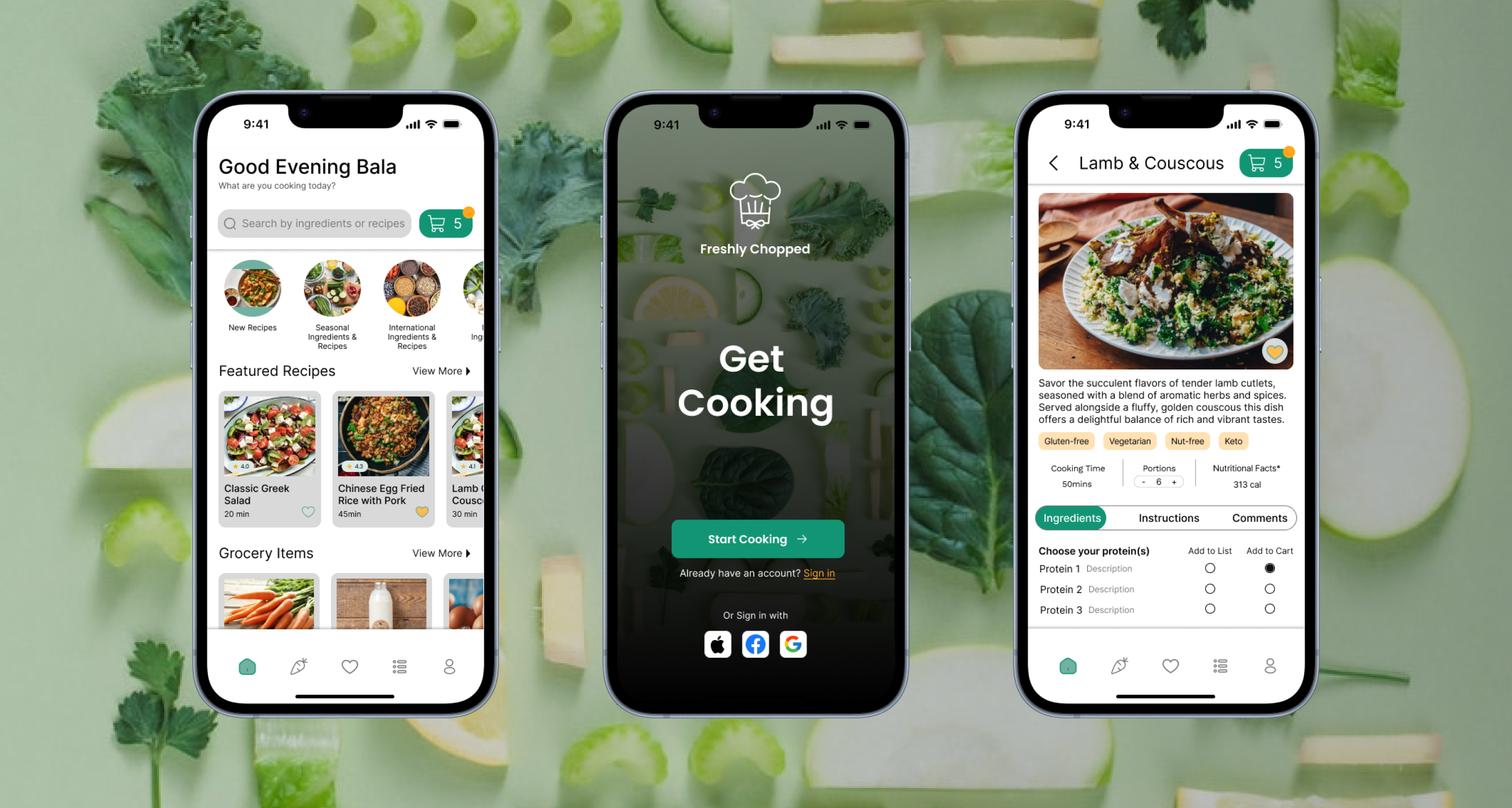
Freshly Chopped New Feature Integration (Mid-fi)
Table of Contents
Project Overview
- Timeline: 2 weeks
- Team Size: 3
- Role: UX Researcher, UI Designer
The Client — Freshly Chopped
Freshly Chopped is a recipe library app. The app is known for their high-quality curation of recipes and recipe-bookmarking. Their mission is to make people fall in love with everyday cooking.
The Challenge — Offering an alternative to meal kits
While Freshly Chopped is successful at providing their clients with fresh and enticing recipes, they’ve found that they do not have an ideal user return rate. Freshly Chopped currently has a 23.2% rate of returning visitors, which they would like to increase to 40%. They believe that their lower user return rate is due to users leaving the app once they’ve collected the necessary ingredients for a recipe. They posit that implementing a grocery ordering feature, as well as incorporating a grocery list within the app, is the way to reach this business goal while differentiating themselves from other meal-kit providers.
The Process — Crafting an experience that inspires a love for everyday cooking
1. Research
In order to position Freshly Chopped amongst their competitors, we looked into their direct and indirect competitors, and conducted a SWOT (strengths, weaknesses, opportunities, and threats) analysis.
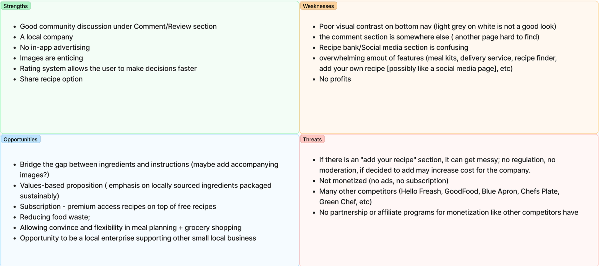
Although the mealkit and grocery delivery market is quite saturated, we’ve identified that Freshly Chopped could make themselves a worthy competitor if they tapped into their local community. One reccuring complaint from mealkit delivery clients was the amount of waste that came along with their orders. Freshly Chopped could build partnerships with local vendors to sell novelty ingredients, and at the same time, encourage their clients to shop at their local stores whenever possible as a way to reduce their carbon footprint.
Design-wise, we opted for a fresh, warm, and minimal palette to appeal to value-driven clients who prioritize sustainbility and community.
2. Empathize
2.1 User Persona
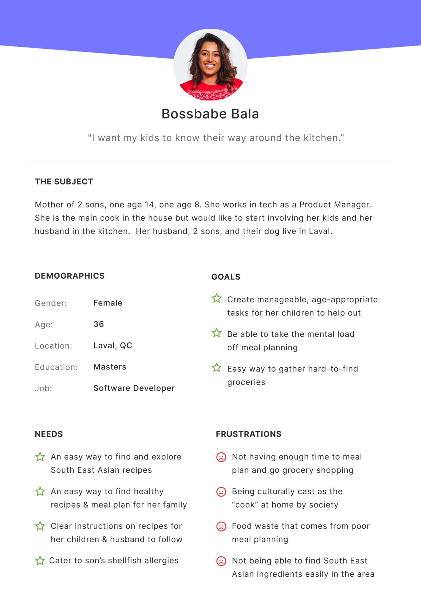
After analyzing Freshly Chopped’s target demographic, we created our persona– Bala.
Bala is a busy mom of two who wants her children and husband to take more initiative in the kitchen. She hopes that through the app’s new delivery feature, she can order the majority of the ingredients to her home while delegating the cooking and shopping duties to the rest of her family.
2.2 Storyboard
We created two storyboards to empathize with Bala’s pain points with the current app versus the ideal, seamless experience she would have once the new features were integrated.
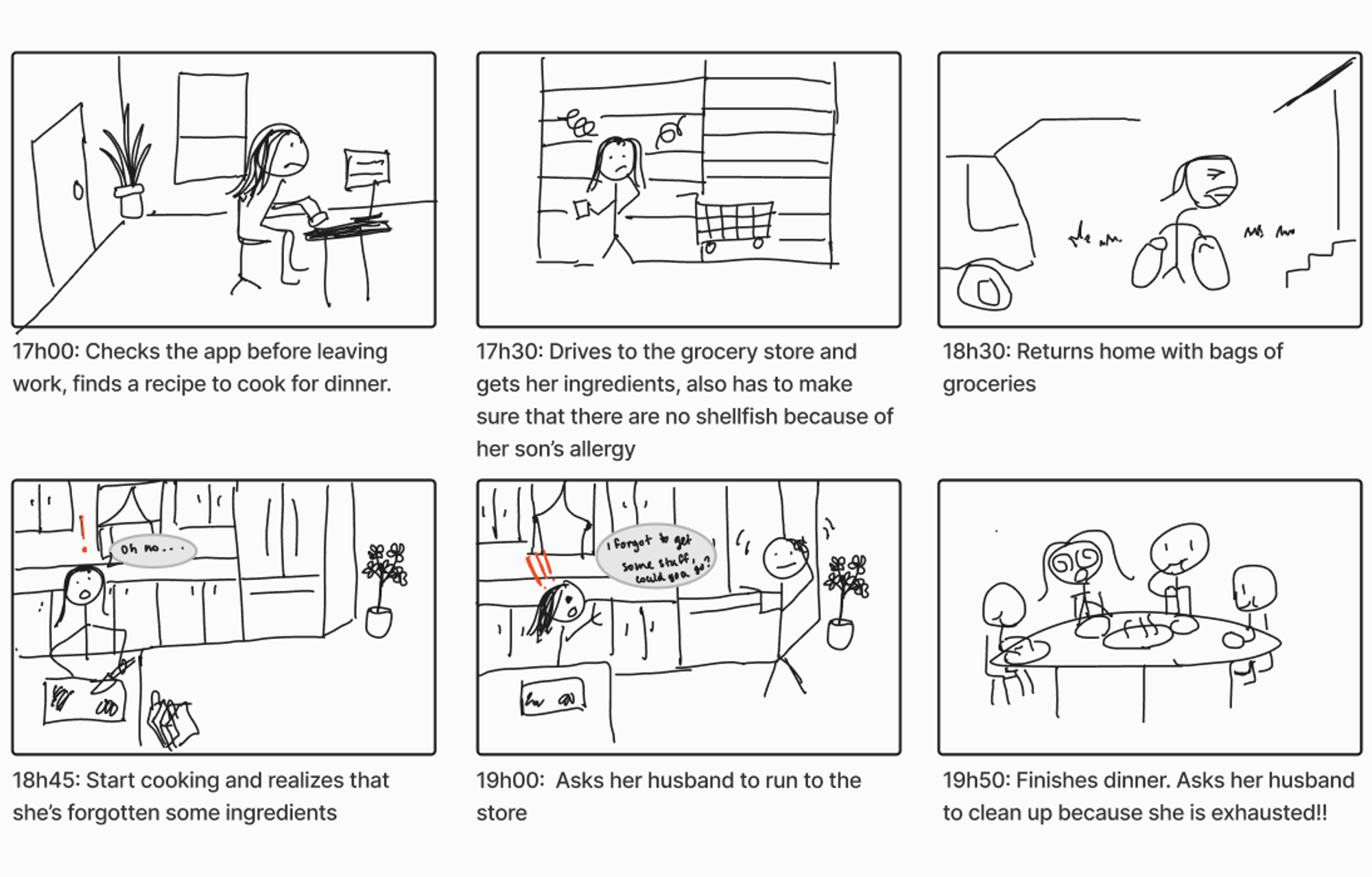
Before: A scramble to put dinner on the table.
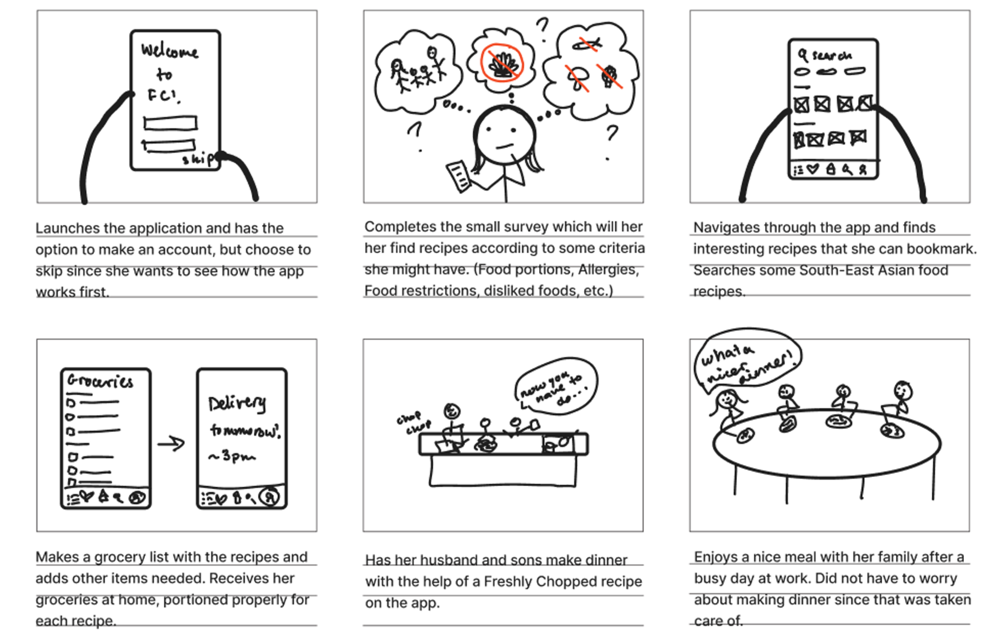
After: Dinner as an organized team effort.
3. Define + Ideate
With Bala in mind, our team came up with the following “How Might We” statements to guide focused, actionable, conversations to make sure the new integrated features aligned with user needs.
3.1 HMW Statements
- HMW encourage users to return to the app after they’ve checked out or saved a recipe?
- HMW accommodate users with dietary restrictions or allergies so that they feel that their preferences are respected?
- HMW make the meal-prepping process seamless for users to plan, gather ingredients and make the recipe?
3.2 Ideating Solutions
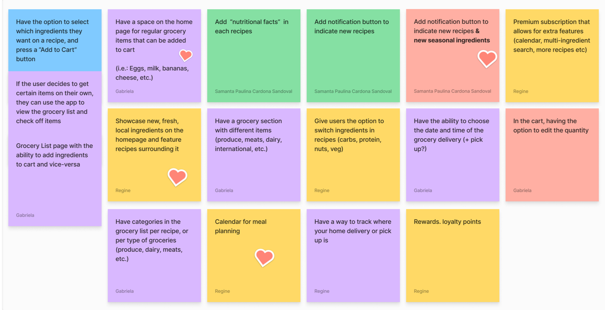
After coming up with the HMW statements above, we brainstormed the following possible solutions and narrowed it down to which would benefit users the most.
4. Prototype + Testing
Now that we had a clear sense of the user pain points and where we were headed, my team and I embarked on the iterative process of creating wireframes, testing our designs and returning to the drawing board.
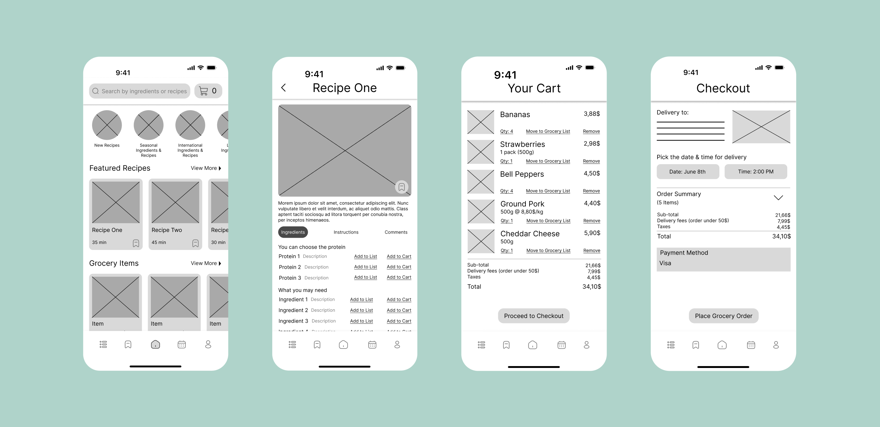
Our group's lo-fi wireframes, primarily built by the talented Gabriela Mayumi Isa
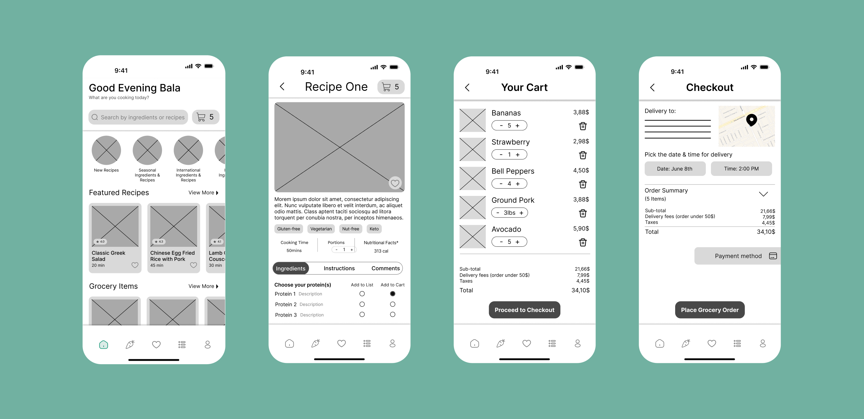
We made serveral subtle changes to our mid-fi wireframes based on feedback from our user interviews, enhancing user experience by providing more information, simplifying customization, and reducing visual clutter.
The Outcome — Glowing feedback on our redesign!
When we presented the prototype to our stakeholders, they were impressed by the highly tailored experience we introduced to the app. From the simple yet thorough onboarding process, to the easily customizable 'Add to Cart' and 'Add to Grocery List' features, as well as additional tools like a meal planner, weekly reminders, delivery time slots, order history, and order revision, we aimed to provide a comprehensive in-app solution that made users feel valued and well-cared-for.
Here’s a peek of the before & after of our project:
FC App before new feature integration
FC App after new feature integration
The Takeaway — Exceeding expectations and creating positive impact.
Integrating a new feature can sometimes feel more challenging than designing an app from scratch, especially when working within pre-existing guidelines. Without careful intention, it can easily end up like buying a shiny new outfit that doesn’t match with the rest of your wardrobe.
To avoid such a mismatch, we made several key considerations. Our goal was to enhance the existing app while preserving its familiar feel, and to expand its features in line with the business's new objectives.
Overall, I believe that my team nailed the brief and exceeded expectations. We truly enjoyed empathizing with users to create something that could make a meaningful, positive impact on their lives. 🌟